Equinox Restaurant Menu Design Printed menu layout, food category organisation and QR menu access for the restaurant section at Equinox Sport & Fitness Center.
Kamog Artistry designed a restaurant menu presentation for Equinox in Kisasi Kulambiro, turning a long food list into a more organised printed menu system with cover artwork, inside spreads, food imagery, readable prices and a back-cover QR entry point for guests who prefer to view the menu on phone.
The project was built around a simple customer experience: open the printed menu at the table, scan from the back cover when needed, or download the full PDF version for easy sharing.
A restaurant menu designed to help guests read, choose and order faster
Equinox needed a menu that could carry many food categories without becoming a crowded price sheet. The design direction used warm food photography, a deep maroon restaurant tone, cream reading panels and clear item rows so guests could move from breakfast to mains, light bites and accompaniments with less friction.
The menu had to feel appetising, but still work like a practical ordering tool
A restaurant menu is not only decoration. It has to guide a customer through the food offer, make prices easy to compare, and make each section feel intentional. For Equinox, the page structure needed to hold breakfast, sandwiches, salads, soups, chicken, beef, goat, pizza, burgers, fish, appetizers and accompaniments without losing readability.
What the design needed to solve
- Break a long food menu into sections that guests can scan quickly.
- Keep item names, descriptions and prices legible on printed pages.
- Use strong food imagery without making the menu feel heavy or cluttered.
- Give the printed back cover a useful QR function instead of leaving it as plain branding space.
How the layout was handled
- Clear food categories were arranged around natural ordering behaviour.
- Maroon backgrounds carried the restaurant feel, while cream panels protected readability.
- Prices were aligned into predictable rows so guests do not struggle to compare items.
- Mockups were prepared to show the menu as a real printed piece before final production.
A printed menu with a useful phone-friendly route
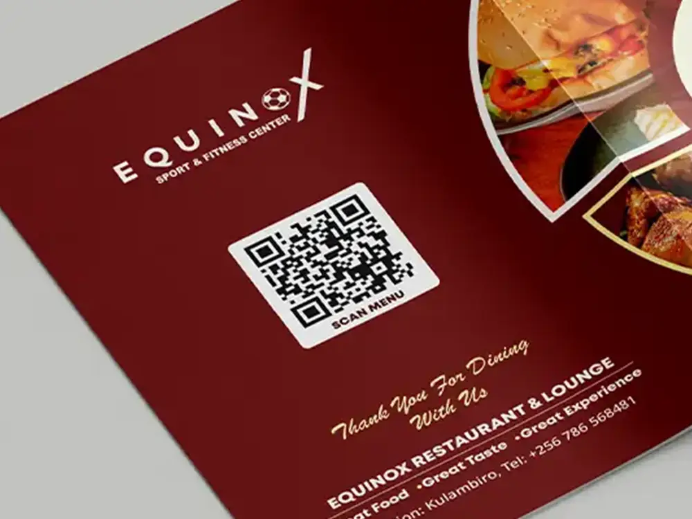
The QR code was planned on the back cover so guests can continue from the physical menu into a digital menu view. This is useful where a customer wants to zoom on the menu, share it, or open the full version without waiting for another printed copy.
From menu content to print-ready restaurant artwork
The process focused on the details that make a menu work in real use: sequence, readability, price clarity, image balance, QR placement and production readiness.
Content grouping
Food items were arranged into sections that match how guests usually browse a restaurant menu, from breakfast and quick bites to mains and accompaniments.
Visual hierarchy
Large category headings, food images and cream content panels were used to create clear reading zones across the spreads.
QR placement
The back cover was planned with a scan area that sits naturally with the restaurant identity, location and contact details.
Mockup proofing
Closed covers, open spreads and back-cover views helped present the menu as a physical customer-facing item before production.
Menu cover, inside pages, QR back cover and artwork setup
These visuals show how the Equinox menu was shaped for real restaurant use: an appetising cover, readable inside pages, clear food sections, a back-cover QR entry point and artwork prepared carefully before production.
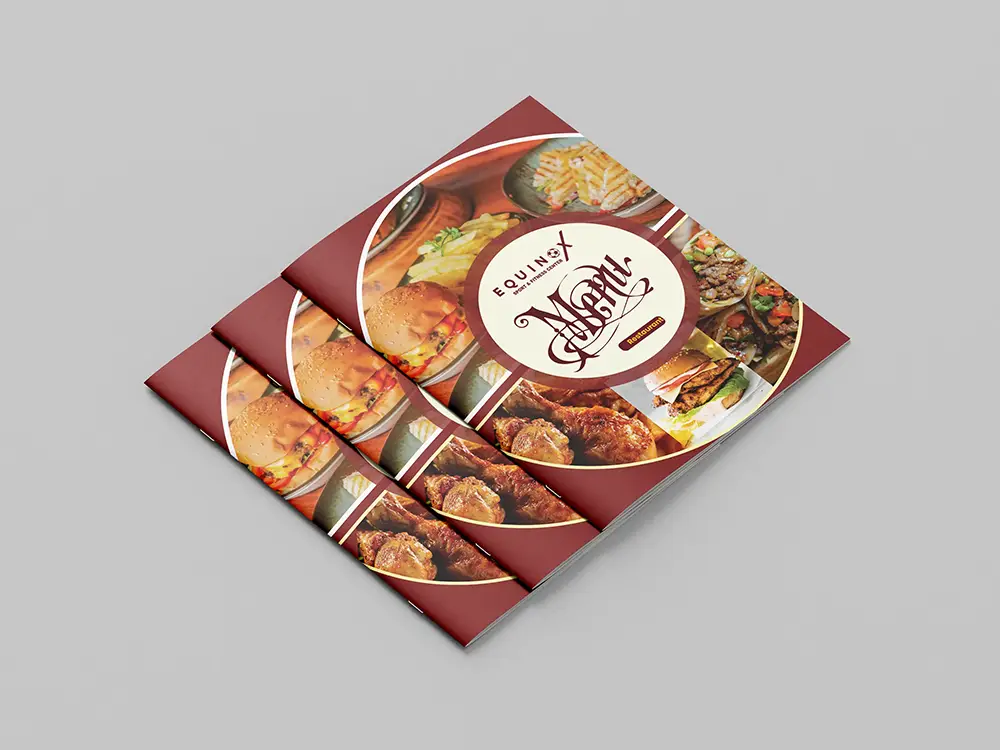 CoverPrinted cover stackA warm food-led cover designed to make the Equinox menu feel inviting before a guest even turns the first page.
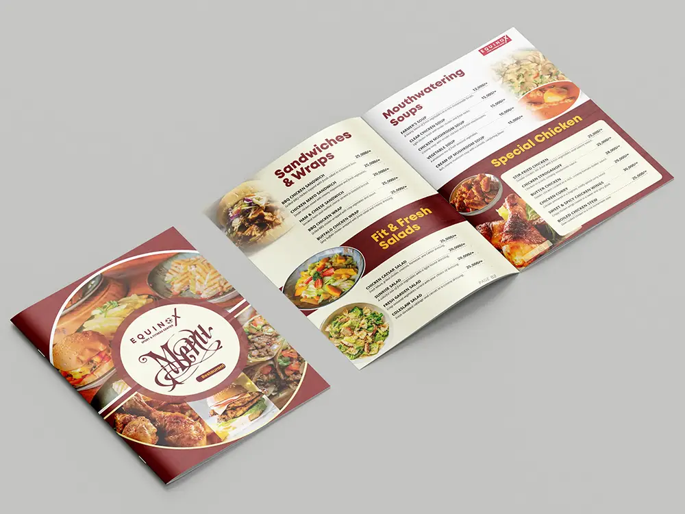 Inside ViewCover and opening pagesThe cover and inside pages work together so guests move naturally from the first impression into the food choices.
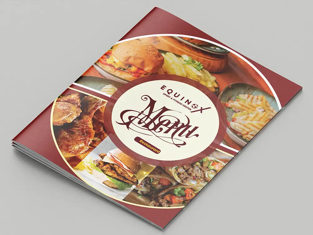 First LookClose-up cover viewA bold maroon cover view with rich food imagery, built to feel memorable on the table or counter.
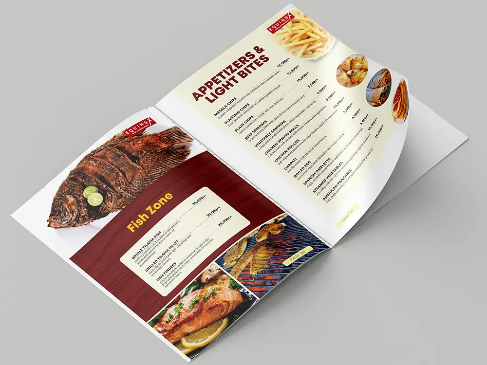 Fish & BitesFish Zone and light bitesFish meals and quick bites are given breathing room so guests can choose without feeling crowded by the layout.
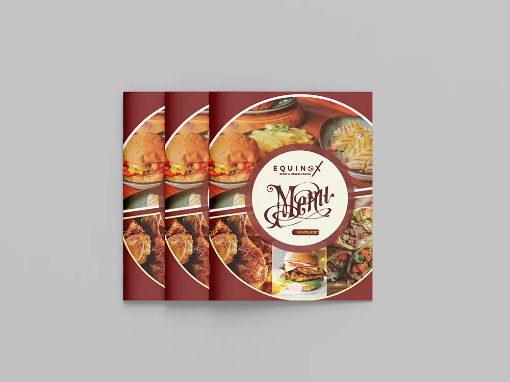 Table ReadyMultiple menu coversA preview of the menu as a set, ready for table service, counter display or guest handling inside the restaurant.
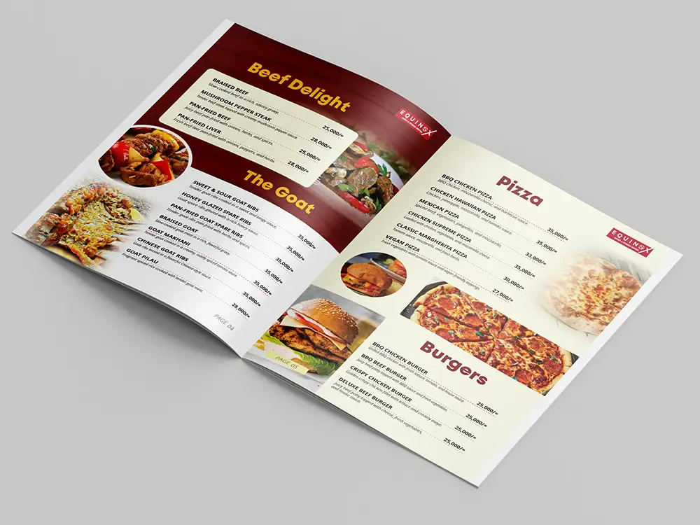 Main PicksBeef, goat, pizza and burgersPopular hearty choices are presented with strong headings and clear prices so guests can compare options quickly.
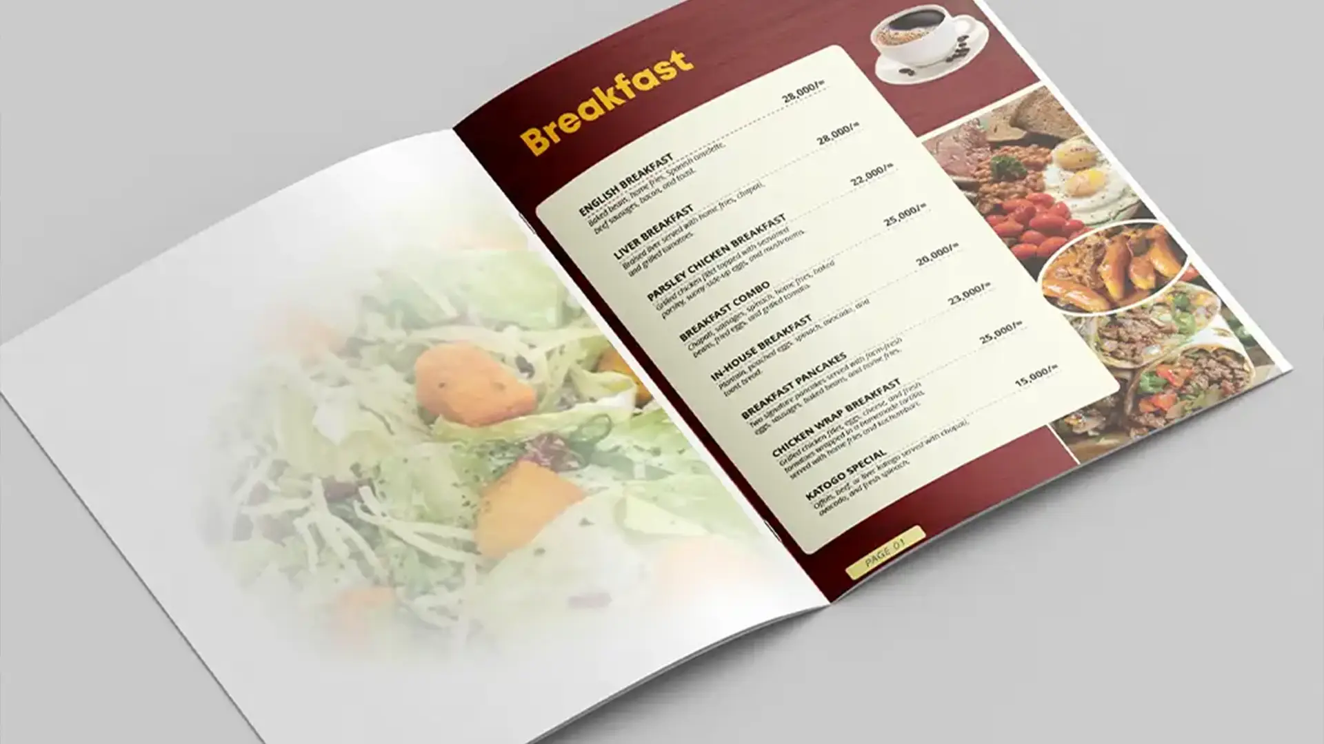
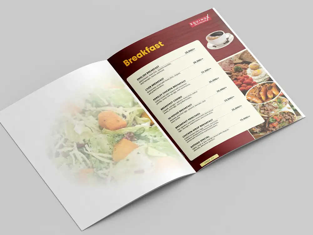 BreakfastOpening breakfast sectionThe breakfast section was given a warm, easy-read layout for guests choosing morning meals, pancakes, katogo or wraps.
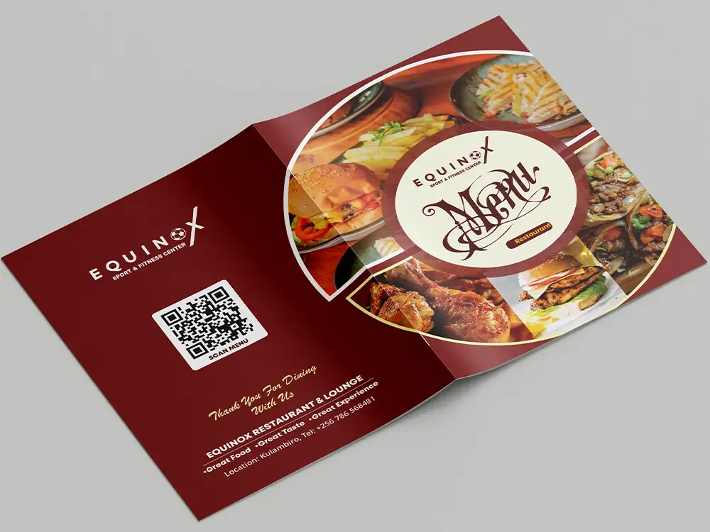 QR Back CoverScan menu accessThe back cover carries the scan menu area, restaurant details and thank-you message without looking like an afterthought.
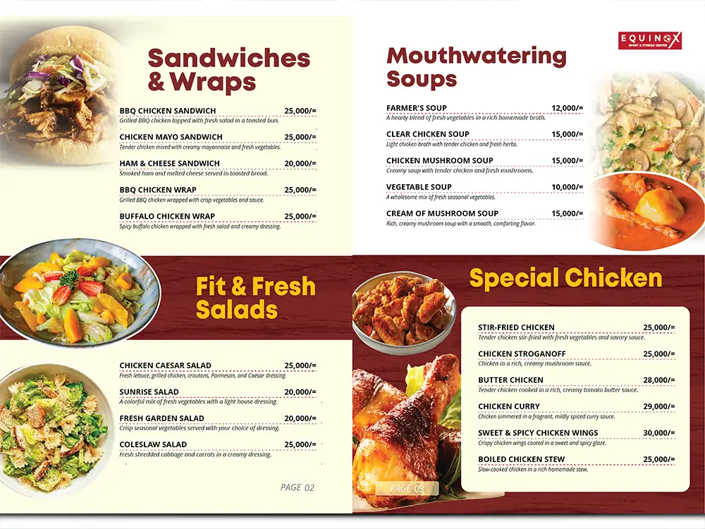 Fresh ChoicesSandwiches, salads, soups and chickenLighter choices, warm soups and chicken meals are grouped clearly so the menu still feels calm and easy to scan.
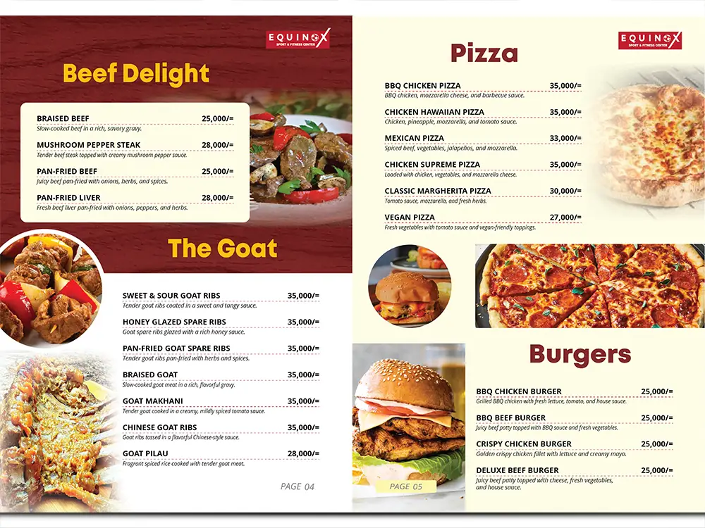 Hearty MealsBeef, goat, pizza and burgersBig appetite sections are arranged with a steady reading rhythm, helping guests move from meat dishes to pizza and burgers.
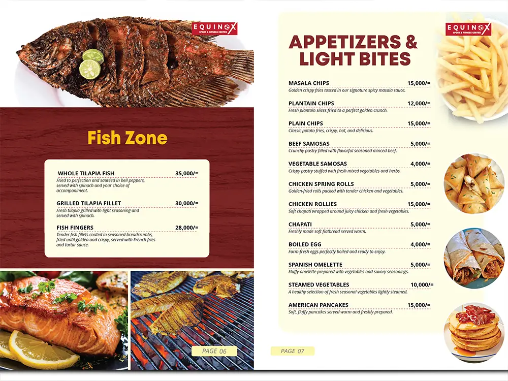 Fish & StartersFish Zone and AppetizersTilapia, fish fingers, chips, rolls and small bites are kept clean and visible for quick ordering decisions.
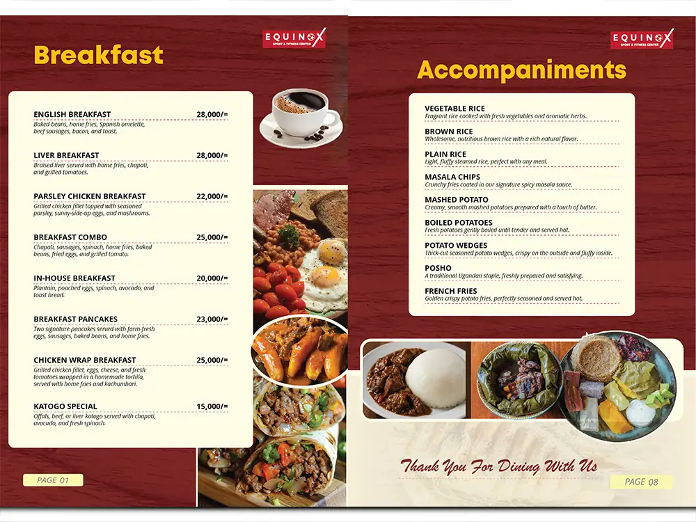 Morning & SidesBreakfast and accompanimentsBreakfast plates and sides are treated as proper decision points, from morning meals to rice, fries, wedges and posho.
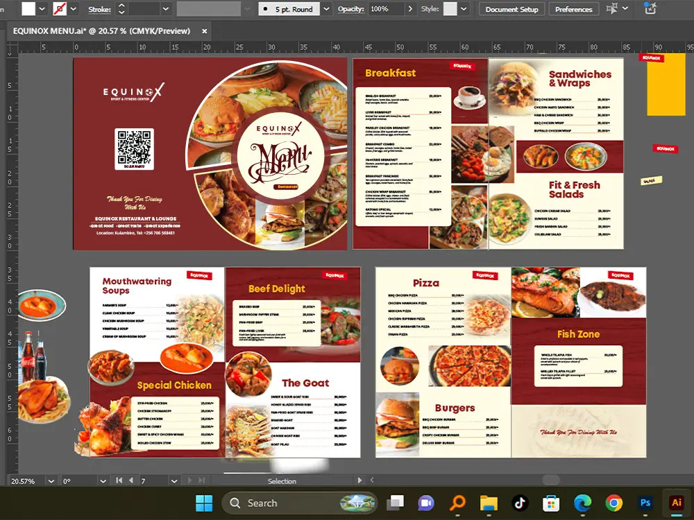 Artwork ProofIllustrator layout setupThe artwork setup shows how the pages were checked and organised before being prepared for production.
Digital AccessQR-linked menu previewThe digital menu preview supports the printed QR pathway and connects the menu to an online customer experience.
Artwork ProofIllustrator layout setupThe artwork setup shows how the pages were checked and organised before being prepared for production.
Digital AccessQR-linked menu previewThe digital menu preview supports the printed QR pathway and connects the menu to an online customer experience.
What this proves for restaurants, cafes and hospitality brands
The Equinox project shows how a menu can be treated as a working sales tool: attractive enough to create appetite, structured enough to guide ordering, and practical enough to support both printed and digital customer use.
For restaurants and lounges, a project like this connects menu design, print-ready artwork, printing support and a QR-based menu experience into one practical system. It is not just a beautiful cover; it is a clearer way for customers to read and order.
What this menu setup means for guests and restaurants
Equinox needed more than a price list. The menu had to feel attractive at the table, easy to read on phone and organised enough for guests to choose without asking too many basic questions.
Why add a QR code to a printed menu?
Some guests want to zoom, share the menu or keep browsing on phone after seeing the printed copy. The QR code on the back cover gives them that option without removing the printed menu from the table.
How do you make a long food list easier to choose from?
We group meals the way customers naturally order: breakfast, light bites, soups, chicken, beef, goat, pizza, burgers, fish and accompaniments. Strong headings, clean spacing and predictable price rows reduce confusion.
Why does the full menu open on another page?
The case study shows the design work, while the digital menu serves real guests. That separation keeps this portfolio page clean and gives Equinox a direct scan destination for customers.
Can Kamog Artistry design this for other restaurants?
Yes. We can prepare a printed menu, phone-friendly QR menu page and PDF version for restaurants, cafés, lounges and hotels. See our restaurant menu design service for the live service page.
Open the customer-facing digital menu or download the PDF version.
View digital menu →
Download menu PDF →